Preston Returns: Journalism and the Market

So today we spent the day with Jeanne Hill learning about the art of good marketing and about the need to get editorial and marketing departments in newspapers talking to each other more.

I think it has become a universial stereotype that marketers and journalists are hardly the perfect image of interdepartmental communication bliss. Journalists often mistake marketers for salespeople and take a “holier than thou” attitude to their supposed editorial integrity. Marketers, I think, assume editorial are incapable of grasping much more than a pen and paper, when it comes to the fundementals of running a newspaper.

But, of course, we’re all in the same business and today was a great insight into how marketing can be used to better understand and then target a readership.

We also assessed the way in which readers are referred to in the newsroom. This sparked a conversation on Seesmic where I asked the community how they wanted to be percieved by journalists (wish this would embed).

Some very interesting repsonses are here (Documentally), here (solobasssteve), here (Pete Ashton), here (Cataspanglish) and here (Hache). There were many more that raised very interesting points, but you’ll have to log onto Seesmic to see the full conversation!

What comes out a lot is that if a reader feels even slightly as if a journalist is not respecting the reader then they will simply go elsewhere. There is an acceptance that objectivity is a myth and that social media provides an opportunity to critique journalists and build a relationship with them, which then provides context to their work.

Obviously most of these guys (and they are all guys) are early adopters, but it was certainly an interesting exercise.

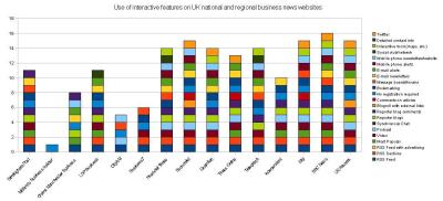
Interaction on business news websites

I’m writing an essay at the moment for my Editorial Leaders course I’m doing at UCLAN.

I’m trying to figure out how people get news from websites, what tools they want and what might make them stick around for longer.

Over the past few days I’ve been putting together a spreadsheet looking at the interactive features used by business news websites in the UK.

The study is based on the 2006 study of American newspapers by the Bivings Report. Most of the categories I have kept the same, although I’m adding some that were included in the South African version of the study (undertaken by my tutor at UCLAN, Francois Nel).

I have also added three more categories: the first is the use of interactive tools such as maps to illustrate a story. The seond is that the site provides a clear list of names and contact details of the editorial team to allow for transparency and accountability. The third is a check to see if any are on Twitter – I know it’s not yet a mass communication device but I think it’s a good indicator of those who are thinking about the development of the market.

The first [second] draft graphs I have drawn up are is below – I’m hoping I haven’t missed out too many things (click on the graphs to see them full size):

Use of interactive features by UK national and regional business news websites:

:Interactive features used by UK business news websites

So, what do you think? There’s an indication that regional news is a little behind the nationals when it comes to interactive features – but some regionals, such as The Post and LDP Business are catching up.

I think there are a few limitations with the categories that are provided and naming individual elements of interactivity does not necessarily give you a strong insight into the experience of the user (e.g. there’s no point having video if no one can figure out how to get to it).

So, how is your experience of a news site improved, or indeed made worse, by interactive tools?

Also, there are a lot of new tools that have now emerged since this study was first done in 2006. As news websites are still not adopting all the features listed in the Bivings Report, it is still valid, but I’m interested to know if there are tools that you think this study is missing. One I’m quite impressed with is the article history feature The Guardian now uses on the bottom of its stories.

Also, are there any similar studies out there?

At the end of it I have to make some sort of conclusion about what works, what doesn’t and what tools newspaper sites might use in the future.

[Edit: Further to comments on Paul Bradshaw’s blog, similar studies were conducted in 2006 in Italy, New Zealand, South Africa and in the UK.]

A new Post & Mail?

The current Post & Mail building on Weaman StreetI’ve been putting off this post because it covers so many things I hardly know where to start.

December was a strange month for me because this blog somehow got me into the group of people developing the new Birmingham Post website (there will be an update on this soon – promise!).

After taking us back in from the cold, I think Trinity Mirror decided it better do something interesting with us… and quickly. I guess the planned move to Fort Dunlop made for the perfect opportunity.

Since then, things have got a little crazy around here.

The laptop is part of it. Apparently, when we all move over to our new site at Fort Dunlop, everyone will be swapping their antiquated Mac Classics for one of these Compaq 6710bs. I suspect the good battery life and the 3G connection are all part of the plan to make Post & Mail journalists more flexible and mobile. From what I’ve heard (although I don’t know for sure) this leapfrogs us over most other Trinity Mirror publications in the technology stakes.

The reason I have my laptop early is because tomorrow I start a new distance learning postgraduate course. It is a Trinity Mirror collaboration with the University of Central Lancashire (UCLAN) and is built around the university’s Journalism Leaders Programme.

It’s in its second term, but two people dropped out and it was decided that one person from The Post and another from The Mail should take up the places. As part of the recent madness, I got asked if I wanted to do it. Well…it was a bit of a no brainer really.

Seminars for the course happen online and that’s why I got the laptop early. I needed a machine that could cope with online conferences. The first seminar is tomorrow afternoon… and I’m nervous. It’s like the first day of school again.

The course looks at the transition of the newsroom as a result of converging technologies and investigates what is required to manage that change… or at least that’s how I’ve interpreted it.

It’s quite a big thing to take on, with at least eight to ten hours of study expected each week. We also have residential weeks every couple of months that seem fairly intense.

But of course I’m excited about it – three months ago I was utterly despairing at the backward technology we have here, now I’m being asked to go on a training course that not only deals with current developments, but also looks to the future. Who wouldn’t be excited?!

There are other things going on around here that suggest to me we’re rapidly time travelling from 1998 to 2008. A rather lovely shiny new Mac has appeared on a desk near to me and a few people are fresh back from video training.

I am under no illusions that fast-forwarding a decade is going to have its problems. You can’t expect people who have been working on Mac OS9 for at least the last seven years to suddenly switch to a completely new system (and continue producing a paper) without a few teething troubles.

But we are finally moving towards the sort of operation I’ve been longing to work for since I arrived and I can’t wait to see what happens next!