My graph is going to be published!

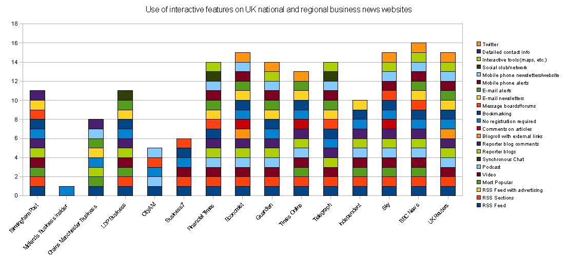
The graph I created looking at the interactive features of UK business news websites has recieved a surprising amount of attention in recent weeks.

I had put it online to get some feedback, but it was picked up by Paul Bradshaw, who then wrote an article on it for Poynter Online. Then the study was replicated in Romania!

Now the World Editors’ Forum has contacted me and asked if I would let them publish it in their annual report!

Of course, I said yes but I want to wait to get my essay reviewed first before I give the final ok. Plus, I have changed the graph a bit and added another website (click on the graph to see the full-size version):

Graph showing the online tools used by UK regional and national business news websites.

g

g

g

g

g

Being slightly on the nervous side, and having never published anything like this before, I’d appreciate anyone willing to give it a quick squiz to see if they see any glaring mistakes

I have had suggestions that I should by grouping the online tools (e.g. subscriptions, comments) by colour, but I have tried and this seems to confuse the graph. I would, if I had more time, like to regroup the categories into those that encourage “short tail” repsonses from users and those that encourage a “long tail” response. (Read more about these concepts on Paul Bradshaw’s description of the News Diamond).

Oh, and if people are more interested in the popularity of online tools amongst business news sites, this graph may be better (again, click to enlarge):

Graph to show the popularity of online tools amongst regional and nation business news websites in the UKg

g

g

g

g

g

Interaction on business news websites

I’m writing an essay at the moment for my Editorial Leaders course I’m doing at UCLAN.

I’m trying to figure out how people get news from websites, what tools they want and what might make them stick around for longer.

Over the past few days I’ve been putting together a spreadsheet looking at the interactive features used by business news websites in the UK.

The study is based on the 2006 study of American newspapers by the Bivings Report. Most of the categories I have kept the same, although I’m adding some that were included in the South African version of the study (undertaken by my tutor at UCLAN, Francois Nel).

I have also added three more categories: the first is the use of interactive tools such as maps to illustrate a story. The seond is that the site provides a clear list of names and contact details of the editorial team to allow for transparency and accountability. The third is a check to see if any are on Twitter – I know it’s not yet a mass communication device but I think it’s a good indicator of those who are thinking about the development of the market.

The first [second] draft graphs I have drawn up are is below – I’m hoping I haven’t missed out too many things (click on the graphs to see them full size):

Use of interactive features by UK national and regional business news websites:

:Interactive features used by UK business news websites

So, what do you think? There’s an indication that regional news is a little behind the nationals when it comes to interactive features – but some regionals, such as The Post and LDP Business are catching up.

I think there are a few limitations with the categories that are provided and naming individual elements of interactivity does not necessarily give you a strong insight into the experience of the user (e.g. there’s no point having video if no one can figure out how to get to it).

So, how is your experience of a news site improved, or indeed made worse, by interactive tools?

Also, there are a lot of new tools that have now emerged since this study was first done in 2006. As news websites are still not adopting all the features listed in the Bivings Report, it is still valid, but I’m interested to know if there are tools that you think this study is missing. One I’m quite impressed with is the article history feature The Guardian now uses on the bottom of its stories.

Also, are there any similar studies out there?

At the end of it I have to make some sort of conclusion about what works, what doesn’t and what tools newspaper sites might use in the future.

[Edit: Further to comments on Paul Bradshaw’s blog, similar studies were conducted in 2006 in Italy, New Zealand, South Africa and in the UK.]